
This
Atlanta house near Chastain Park offered a change of lifestyle for the
young homeowners, who moved from a high-rise to this European-style
house so they could have more room for entertaining and a yard for a
dog.
A
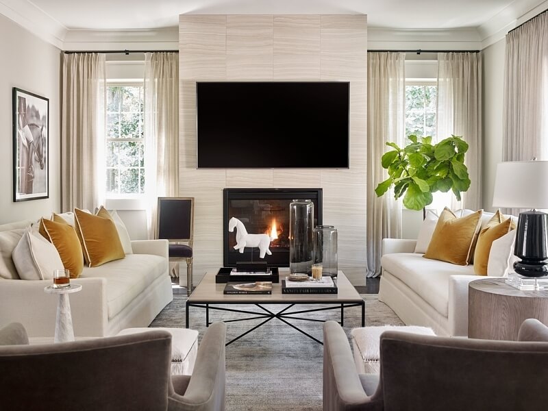
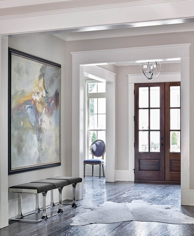
beloved painting in the foyer sets this design story in motion … look
for its splashes of color in subtle ways throughout the house.
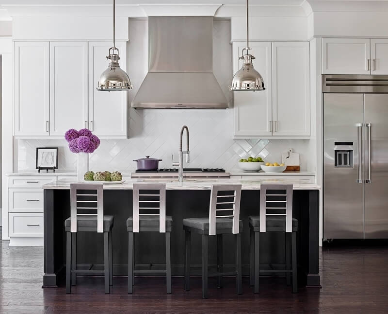
Touches
of modern — the sculptural faucet, a herringbone-design for the
backsplash and those groovy bar stools — meld with marble countertops
for a contemporary/classic mix.
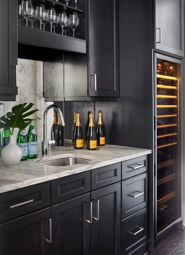
A
large wine refrigerator in the bar area speaks to the homeowners’ love
of vino. “The island and bar area are painted dark, which is inspired by
dark veining in the countertops, to add depth along with grounding the
space,” says Kit. “The antique mirror backsplash adds a dressy element
to the space. I always love antique mirrors … they give the space a bit
of sparkle and bring more reflective light into a small space.”
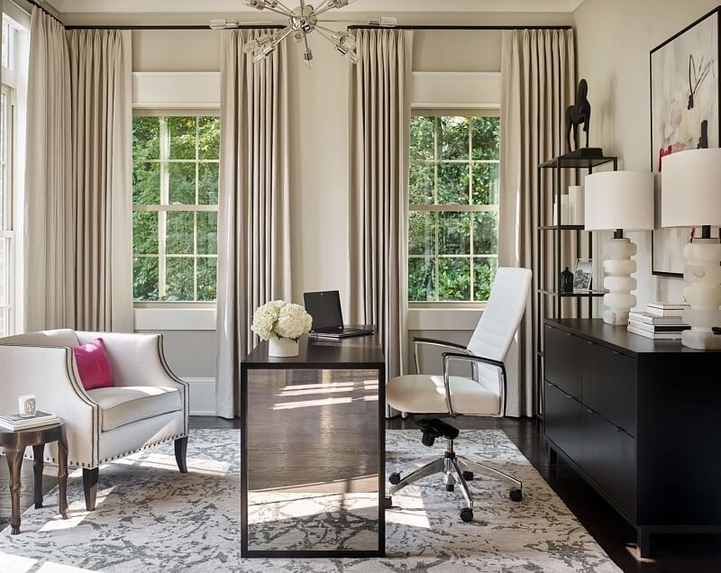
A
flash of pink and a “sputnik” light fixture liven up the wife’s office.
“We wanted to create a workspace that felt feminine yet was extremely
functional,” says Kit. “The mirrored desk by Mitchell Gold + Bob Williams adds a feminine element, while the Greek-inspired linen chair is classic. Wool rug is by Kalaty.
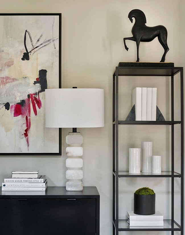
Alabaster lamps from Visual Comfort bring in an earthy element to the office.
Kit continued purple tones in the kitchen, which has a pop of this non-traditional kitchen color in bar stools against an otherwise classic white and black room. “My clients’ styles were quite different from each other, since the husband tends to lean more on the traditional side, and the wife is much more modern,” she says. “So my transitional design style was a perfect fit for the space.” She continued the sophisticated-modern vibe into other rooms, making sure to layer in textures as well as color to add depth; velvet, linen, wood, iron, leather, concrete, crystal and a live plant or two as just some of the tactile additions.
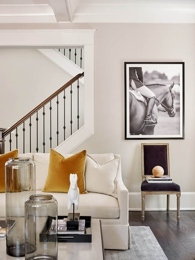
When
designer Kit Castaldo saw this photo of the homeowner on her horse, she
knew it would be perfect art for the living room. “I truly want my
designs and the finished space to reflect the personality and character of the people who live in them,” she says.
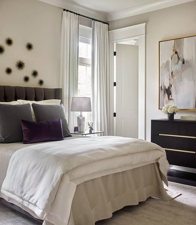
The
master bedroom features a soft, neutral palette of cream, white and
gray with more art inspiration to prompt purple jewel tones. Custom
white linen drapery is banded in a grey trim tape by Robert Allen Design to frame the space.
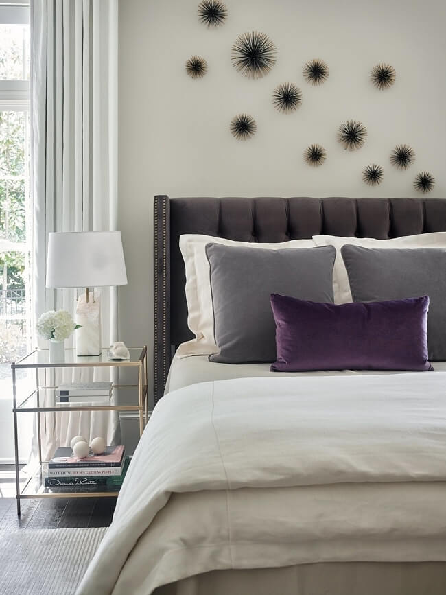
Those dreamy bed linens are from Peacock Alley.
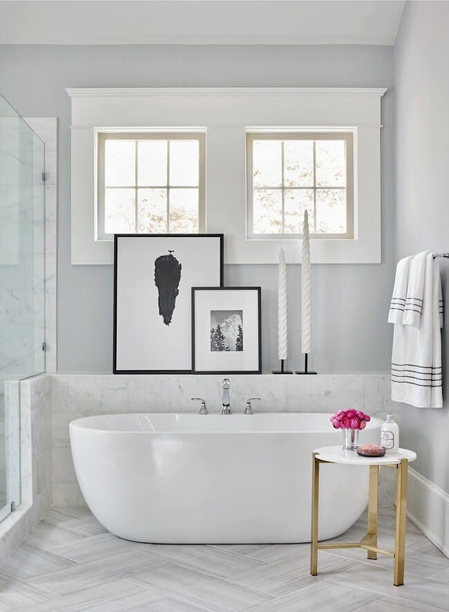
Floor
tiles are installed in a herringbone pattern as an update to
traditional flooring. Black and white art provides a classic backdrop.
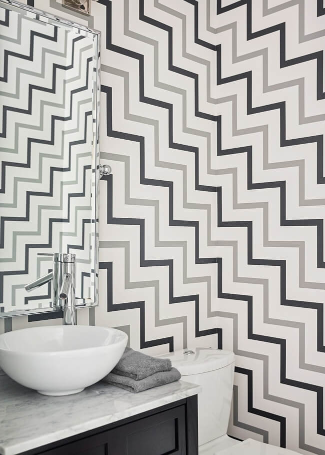
“My
client is extremely fashion-forward, and she wanted something fun with a
lot of personality in the powder room,” says the designer, herself with
a background in fashion before turning to interior design. “I’ve always
had a passion for Oscar de la Renta’s bold striped dresses, so when I came across this modern zig zag wallcovering by Oscar De La Renta, it was love at first sight for both of us.”
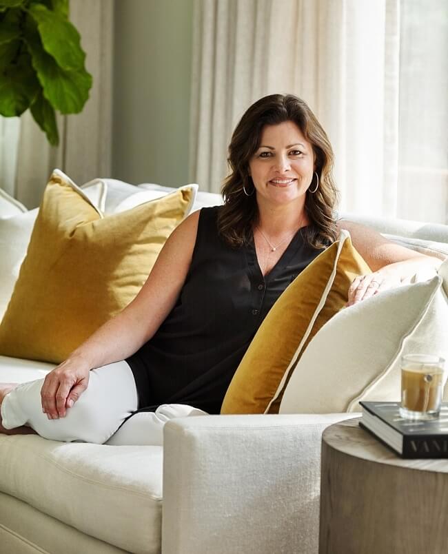
Interior
designer Kit Castaldo had a career in sales before going back to
college for a second degree — this time in interior design — and after
an internship with Amy Morris Interiors began her own firm.
No comments:
Post a Comment