When I was in
Southern California this summer, I stumbled upon a wonderful interior
design studio with a store attached, and this store had the most amazing
selection of rocks and minerals for sale (for use as accessories).
The stone spheres in particular caught my eye – I love the shape, and
they had a huge array of colors and sizes.

Since that visit, I have been
collecting pictures of spheres that I noticed on Pinterest or in my old
interior design image files. I was surprised to note that some of my
favorite room images from the past have spheres used as accessories – I
had not even noticed!
Here is a good example. This picture
has been on my blog countless times. Something about this room has
always had great appeal to me – the combination of the sand color of the
sisal, the grays of the wall and upholstery, the contemporary art, and
the white tulips (my favorite) – it all comes together beautifully. When
I looked at this picture with fresh eyes, I spotted the spheres on the
side table – one large, and three small. The small ones could be mounted
finials. Interior design by Gerrie Bremermann.
When I opened up this month's Veranda and saw the beautiful house of garden designer Scott Shrader,
I noticed the many spheres he uses throughout his house, inside and
out. This was my favorite house from the magazine - in no small part
because of the calm, beautiful, and balanced interiors.
I featured this room on my blog several
years ago. I wondered how the designer got all of the mercury glass
spheres to stay in place, not knowing about museum wax when I wrote the post! Interior design by Caldwell Flake.
A Suzanne Kasler Interiors
designed room, seen in a recent issue of Architectural Digest, is
beautifully layered. The sphere on the coffee table caught my eye.
Suzanne frequently uses spheres in her accessory design for a room.
The mantel of Suzanne’s own family room features a stone sphere.
Another Suzanne Kasler design with a grouping of stone spheres on the lower shelf of the console.
I think this sphere is part of the lamp; what a beautiful design. Via Elle Décor, interior design by Kevin Roberts.
I love the look of a sphere on a bookshelf.
I can’t locate the source for this image, but all of the spheres on the table caught my eye.
A crystal ball like sphere is a great element of this expertly styled coffee table. Via Bijou and Boheme.
A collected group of objects on a table
include several spheres, which cleverly repeat the shape of the rounded
feet of this Biedermeier table. Via Savvy Home.
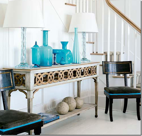
A more rustic style stone sphere anchors the arrangement on this console.
I saved this picture in my old computer
files because I liked the composition of the room, the art above the
fireplace, and the indoor greenery. But this time around I noticed the
sphere on the console, and what appears to be a large sphere on the left
side of the room.
White spheres blend right in with this pastel palette.
A solidary large scale sphere is the reward at the end of the view in this more rustic style design.
In the recording studio of two concert pianists, a sphere carved by Thai monks is placed by designer Axel Vervoort. Via Architectural Digest.
Another favorite place for a sphere is on a mantel. Interior design by Caldwell-Beebe, one of my favorite rooms of theirs.
This house was on a tour of homes a few
years ago, and I snapped a picture of the landing with its perfectly
scaled wing chair (anyone recognize it?) and the three wood spheres that
surround it. It’s a striking vignette.
One of my favorite Amanda Nisbet
designs – there are other versions of this picture without the spheres,
but I like the element that they add.
As I was putting the finishing touches on this post, I read an article in the New York Times about the new magazine Milieu, published by Houston based designer Pamela Pierce.
One of the designers featured in the premiere issue is Walda Pairon. The work of this designer from Belgium captured my eye. Remodelista
had written about her this spring, and this close up of a vignette from
Pairon’s living room particularly spoke to me. As Remodelista notes,
“Pairon puts great importance on the placement of objects; nothing
should be gratuitous”.

I think that sums up why spheres have
such great appeal to me. Their placement seems quite deliberate, they
have such a calming and balanced effect to a room, and they are often
one of my favorite ways to complete a space. Clearly spheres have great
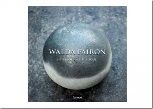
appeal to Walda Pairon too – she chose an image of a sphere for the
cover of her book Interiors with a Soul (which does not seem to be readily available in the US right now).
What do you think of spheres? Do you
have any in your décor? I bought a beautiful sphere off ebay earlier
this year, but I have not found a place for it yet. I am thinking about
putting it in a bookshelf, out of the way of curious hands (my kids)
and enthusiastic tails (my dog).


No comments:
Post a Comment