Thursday, November 30, 2017
Saturday, November 18, 2017
Homemade Thanksgiving Decoration Ideas
31 Easy Fall and Thanksgiving Centerpiece Ideas.
Holiday
season is the opportunity for people to decorate their houses and, if
they have one, their lawn or yard. The same goes for Thanksgiving
decorations that reflect the harvest season as well as the beautiful
red, gold and brown colors of fall. While some of these ornaments were
developed by the old European pagan folks and used for the end of
harvest season celebrations; some ornaments have wholly been created
during the twentieth century.
It is typical to see, on the gardens or yards of many houses, foddershocks or bundles of cornstalks placed with other Autumn symbols such as pumpkins, cushaw, scarecrows and other decorations related to the fall season.
For instance, the "wicker man" is one of these decorations, born from the old European pagan traditions. This decoration was filled with the first goods from the crop and given as a present to the gods before being burned in their honor.
Saturday, November 11, 2017
Friday, November 10, 2017
Wednesday, November 8, 2017
Italian Interior Design: 19 Images of Italy’s Most Beautiful Homes
In contrast to French interior design — where urban domiciles in large part conform to a highly codified archetype
— a collective, agreed-upon notion of Italian interior design is up for
grabs. Is it reflective of the sleek, clean-lined Milan appartamenti?
Or the rustic, terra cotta-colored villas of the Tuscan countryside? Or
perhaps an elegant, historical Florentine home? The best answer, of
course, is all of the above. Italian design — like the country’s history
— is marked by a regionalism that breeds eclecticism, diversity and an
artistic sentiment that favors experimentation. This week, as we
celebrate makers of Italian design,
we paused to take an off-the-moment survey of some of the country’s
most beautiful rooms. Scroll down to get some Italian inspiration,
region by region.

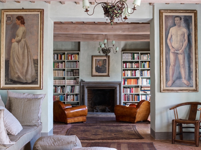
Opulent finishings in the living room of the late furniture designer Carlo Mollino’s home in Turin contrast with a more casual, distressed approach to objets and upholsteries.
Photo by Bart Kiggen.

Interior designer Paola Navone used both modern and rustic elements in her restoration of a former Armani exec’s centuries-old Tuscan villa.
Photo by Jean-Pierre Gabriel.
Tuesday, November 7, 2017
Find The Best Options For The Interior Design Ideas For Low Budget
Interior design can be a leisure activity or a need contingent upon the
space you are given to work with. The best part is that regardless of
the possibility that you're working with virtually nothing you can zest
up your surroundings without using up every last cent. Nothing feels
superior to lounging in a room that has been spruced up with individual
touches. Little changes can have the greatest effect so dependably be
vigilant for minor alterations that suit your budget! Here are some tips
that you can utilize for the interior design ideas for low budget.


Monday, November 6, 2017
How DIY Design Can Curb Costs for Restaurants

Design costs for the dining area of a restaurant can run $120–$300 per square foot or more depending on the desired look and feel. The luxury furniture and finishes expected in full-service, fine-dining restaurants generally have the highest price tags, but even décor components of limited-service restaurants can be pricy.
To get a handle on design, Washington, D.C.–based chain &pizza turns to design director Heidi Guerard, who says controlling costs is a matter of priorities. &pizza doesn’t spend much on ceilings and floors, choosing to simply polish the concrete below and paint everything black above rather than pay for ceiling or floor tiles. That industrial look frees up funds to invest on art murals for the walls. Design flexibility also helps the growing pizza chain save money.
“Every shop design is different,” Guerard says. “We don’t use all the same materials in every restaurant, which means we can play with new materials.”
One design experiment that paid off for &pizza was using tiles that cost $1.50 per square foot and cutting them at an angle instead of buying specialty tiles priced at $25 per square foot.
Seoul Taco is another rising chain that has developed clever hacks for saving money on design. Owner David Choi worked with Chicago’s SmartMouth Designs to evolve his St. Louis food-truck business into five stores spread across St. Louis; Columbia, Missouri; Champaign, Illinois; and Chicago. Choi says a typical restaurant might spend $125,000 on furnishings for a restaurant, but by using reclaimed items, Seoul Taco is able to furnish a restaurant for around $65,000.
One way Choi saves money is by combing through thrift stores for old boomboxes that are then spray-painted bright colors and used to decorate an entire wall inside every location. Since the business started as a food truck, Seoul Taco also repurposes pieces of old trucks as design elements. And behind the counter of every Seoul Taco, the wall is full of words in a variety of sizes, fonts, and languages. The words are cut out of plywood and painted.
“It’s fun to do, and it fits our atmosphere and vibe,” Choi says of the DIY decorating.
Choi says Seoul Taco’s Midwest base of operations ensures a supply of reclaimed barn wood to use on restaurant walls. Reclaimed bowling alley wood has been used for countertops.
There are some areas where both Choi and Guerard refuse to scrimp, and that’s tables and chairs, which constantly take a beating in a restaurant.
“We could save money with two-tops and four-tops, but for us that looks cluttered, so we choose to invest in durable commercial-grade community tables for &pizza,” Guerard says.
Seoul Taco tends to move into existing spaces rather than build restaurants, and Choi says if a space they take over has high-quality booths in place, they’ll save money by reupholstering rather than purchasing new ones.
“We go off what a location provides, which then gives us flexibility and not the same box model,” he says.
Being relatively small chains, &pizza and Seoul Taco are able to cut costs by designing stores individually. At a certain point in a concept’s growth trajectory, however, duplication from unit to unit saves money.
Jackson, Mississippi–based Newk’s Eatery, for example, has managed to cut construction costs by as much as $80,000 per store as they pursue the goal of 200 units by 2019.
Mike Snyder, Newk’s Eatery senior director of construction, says the key to cutting costs is to look at the entire construction budget line by line. Because Newk’s added 16 stores in 2017 and plans at least 20 more for 2018, most of the savings are the result of procuring materials in volume for multiple locations.
Instead of building cabinets on-site during construction, Newk’s orders them pre-built, pre-assembled, and pre-stained from a single supplier. It ensures a consistent look and shaves time off of the construction schedule. A single-source millwork vendor took $20,000 out of the construction budget for each new Newk’s store.
Snyder did find some design elements that are non-negotiable, but even these benefited from tweaks. For example, in reviewing the construction budget, Snyder learned that the door pulls Newk’s specified were a half-inch oversized for a standard door, so standard doors were being scrapped and new custom doors ordered. The door pulls were accordingly retooled, saving $14,000 per store.
Whether a restaurant has two locations or 200, owners must find clever ways to share their brand narratives while still saving money on design, says Chicago-based branding expert Adrienne Weiss.
Repurposing, Weiss says, is a consumer trend that has spilled over from home décor and been adopted by limited-service restaurants to cleverly save money on design.
“Every design decision should be viewed through a brand filter,” Weiss says. “If your brand is really quirky, then you get more latitude. Make sure the store design is consistent with the brand story you want to tell.” source
Saturday, November 4, 2017
2017 Thanksgiving Table Decorations Video
Easy and inexpensive Thanksgiving crafts that can be done whether you're crafty or not. Give a Thanksgiving look to your cozy home, create your unique awesome crafts!
This chill DIY yarn wall hanging turns any room into a bohemian paradise
Bonus: This big impact project is so low-effort you can make it while binging your favourite show this weekend

Here's what you'll need:
- 6 balls of yarn in assorted colors
- 1 ½ meters macrame rope
- .60 meter dowel rod
- 2 stick-on wall hooks
- Scissors

DIY Decor: Getting personal with dry paper collage

I’m not a big fan of “cute” in my own home. So, to be honest, this framed collage, with its greeting card vibe, will be gifted to someone for a baby’s room or the like. But, with different objects from the house and plants, and with papers sporting different patterns and colors, cute could become symbolic and sophisticated.
Design Tips for Home Libraries
How to use light, color and, of course books, to create a perfect spot to read
By Jennifer TzesesEach week Mansion Global tackles an interior design topic with an elite group of designers from around the world who work on luxury properties. This week we look at how to design a warm and inviting library.
In a world where dog-earing has given way to double clicks, a library at home has a kind of old-world charm. Whether you have the luxury of turning an entire room into a refuge for reading or simply a cozy nook, creating this kind of space can bring an instant sense of calm.
“Your library is a record of who you are,” said Jeffrey Forrest founder of STACKLAB, a multi-disciplinary design studio based in Toronto. “Design decisions should be deliberate and very personal—with equal focus on celebrating your history, but also on the joy of reading.”
“Libraries also afford great opportunities to showcase collections, hobbies, and other personal interests,” said Corey Damen Jenkins of Corey Damen Jenkins & Associates in Michigan. “The first step in determining a library’s look and feel is asking yourself a question: ‘What should this library say about me?’”
Subscribe to:
Comments (Atom)


