Wednesday, July 15, 2015

Rustic Country Kitchen

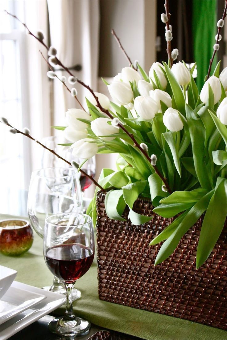
These are some simple white flower arrangements that I use regularly in styling my own home and clients' homes. They are especially effective for a dinner party, are easy to arrange and make you look like an expert interior design stylist. Try some and have fun!

simple white flower arrangements
This centrepiece contains one bundle of pussy willows, two bouquets of white tulips and one small storage basket.

White Wall Inspiration

source

 Cool or warm, sparse or cozy..white walls offer many things to those who choose to share their home with them.

Modern Furniture Apartment Style Tips

sourcemodern interior of the room
Modern apartment life is no longer only available to those in high-fashion magazines. Modern furniture is everywhere today, and with a bit of planning and creativity, you have the ability to style any space with elegant, classy, sleek furniture and designs.
Choose a Color Scheme Ahead of Time
When working with smaller spaces including apartments, choose a color scheme with one to three colors. Stick with whites, off-whites, beiges, browns, and other neutral colors when attempting to broaden the appearance of any room or space in you apartment. Many modern color schemes include black and white in addition to another color, such as red, green, or navy blue.
Leave “White Space” on Your Walls
In modern design, “white space” is often referred to when working to develop websites and applications. However, it is also commonly mentioned when designing modern spaces in small areas. Although bright and original artwork is an ideal way to create a unique atmosphere in your apartment, be sure to leave enough space between paintings and photos to ensure you maximize how large the room appears altogether.

Tuesday, July 14, 2015

Our Top Five Favorite Mad Men Design Moments

    Posted by Becky Now that Don Draper finally nailed the ultimate account and Mad Men has disappeared into 1970 forever, I’ve been binge watching the whole thing all over again on Netflix. There were so many fantastic moments of graphic design, fashion design, even hair design (and some not-so-good ones, those ’70s staches and sideburns were not doing the characters any favors). But most of all, I loved to watch Mad Men for the spot-on 1960s set design.
There are too many to count; with all that Eames, Saarinen and other mid-century icons lurking everywhere. Here are some of the highlights:
FullSizeRender copy 3
What does this guy need an office for? No actual business ever happened here, except for a fake phone call to Lee Gardner over at Lucky Strike weeks after Roger had lost the account.

Restrained Exuberance

 source

I painted the floor of my oldest's nursery almost nineteen years ago.  It was white with a Wedgwoody blue border.  I have longed to paint another floor since and have measured and sketched meanders and hexagons, but have not again taken brush to wood.

The first thing I did to my current house was rescue her from the troubling orange cast of the light stain of her floors.  (Who thinks that color is a good idea? It should be illegal.) Having invested a good little bit in the no-red-not-too-black-just-rich-brown shade that runs throughout, I can't come to terms with painting over it.

But, oh, that blue in Christopher Spitzmiller's country house! Bold, yet grounding (no pun intended - okay, maybe a bit) this floor made my pulse jump and fingers itch for a brush the second I saw it.  This is one of those great rooms that if someone were to describe it to you - "Under the eave, snappy red and white chrysanthemum wallpaper, painted furniture, bright blue floor." - might make you say, "Hmmm." And yet, on sight, it's perfection.

I still can't cover my floors; there were too dear.  But my porch floor, she who was cracking and peeling not one but three layers of paint, was recently stripped.  The poor darling, I had planned on leaving her bare, to recover and breathe a little bit.  I'm not going to break it to her yet, but I have a colorful future planned.

Image, Christopher Spitzmiller's farmhouse in Architectural Digest, July 2015.  Photography William Waldron; produced by Anita Sarsidi.  Spitzmiller's spool bed once belonged to Albert Hadley.  If you can find one with similar pedigree, I say, do. But I run across these beds pretty regularly and they do look awfully swell painted.

This seems the perfect image to kick off the holiday weekend! Enjoy!